
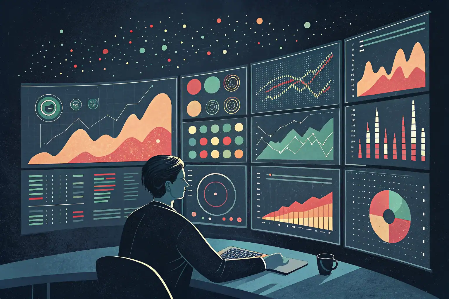
A monitoring platform showing all green on a Monday morning doesn’t mean the past week went smoothly. It means that, at that precise moment, nothing is exceeding the configured thresholds. It’s a snapshot. And a snapshot doesn’t tell the whole story.
It’s from this simple observation (one that is rarely articulated) that part of our work at Sensor Factory has been built: the behavioural analysis of our clients’ monitoring platforms. Not the analysis of the monitored infrastructure itself, but of the monitoring layer, what it produces, what it says, and above all what it quietly signals without anyone really listening.
What a platform actually produces, beyond alerts
Every monitoring platform continuously generates a stream of events. DOWN states, UP returns, crossed thresholds, failing checks, oscillating sensors. In a mid-sized organisation, this easily amounts to several thousand events per week. Most go unnoticed, either because they were acknowledged, because they resolved themselves before anyone saw them, or because they occurred overnight when no one was watching the console.
We ingest this stream into our log centralisation stack and make it readable over a rolling week. What we look for isn’t the incidents (the teams already know about those). It’s the patterns: which devices generate the most events? Which sensor types are the noisiest? At what times do issues cluster? Is the volume growing, shrinking, drifting?
It’s this kind of reading, transversal, temporal, detached from the moment, that starts to tell something interesting.
Monitoring that is blind to time
Two examples, real, anonymised.
The CPU that degrades without ever triggering a proper alert. An application server regularly shows CPU load spikes. Nothing unusual on the surface: the alert threshold is set on a point-in-time saturation percentage, which fires and then disappears. Teams see the alert, notice it resolved, and move on. What the behavioural analysis reveals, week after week, is that these saturation plateaus are getting longer. This is precisely what Brendan Gregg’s USE method identifies as the most treacherous signal: not a hard failure, but a saturation that drifts progressively without ever breaching the configured threshold. What used to last two minutes three months ago now lasts eight. The alert still fires, the threshold hasn’t changed, but the system’s behaviour has fundamentally shifted. Nobody noticed, because each alert, taken in isolation, seemed perfectly normal.
The disk space that fills up overnight. A database infrastructure, with a classic nightly backup process: each night, a dump is written to disk, space climbs, an alert fires, then the dump is archived or purged and by morning everything is back below thresholds. Green. Clean. During the day, no one sees anything. Except that when you look at the trend over several weeks, something mechanical becomes visible: the dump is growing. Not because something is broken, but because the database itself is growing, perfectly normally. The nightly fill level creeps up week after week, millimetre by millimetre. The question that then becomes unavoidable is simple and uncomfortable: what happens the day there isn’t enough space left to generate the dump? The answer is blunt. The backup doesn’t run. Silently. Without any visible incident. Until the day you need it. The alert had been firing every night for months. Nobody had noticed it was ringing a little louder each time.
Both situations share one thing: the alert wasn’t missing, the ability to read it over time was. The console showed a correct snapshot every single time. The film, however, showed a progressive degradation that no one had pieced together.
The outside perspective as a method
It would be easy to conclude that internal teams aren’t doing their job. That would be wrong, and unfair. The issue isn’t one of competence, it’s one of angle.
An IT team embedded in its own context handles alerts as they come, manages current priorities, responds to business requests, juggles political and budget constraints. They’re inside the film, precisely. What they can’t easily do is step outside it and watch from a distance.
That’s where an external party operates differently. Not because they’re more skilled, but because they’re structurally detached from the internal context. They don’t know what tensions exist between the IT department and a given business unit. They don’t know the history of a particular server or the constraints around a specific vendor. They arrive with raw data and a naive question: why does this sensor flap every Monday morning at 7am?
Sometimes the answer is straightforward (a scheduled task, a poorly managed maintenance window, a service restart). Sometimes it opens something the client hadn’t seen. And sometimes it points to a problem they can’t do much about, stuck between an uncooperative vendor and a legacy infrastructure, but at least they know about it, they can anticipate it, they can flag it to management.
It’s that small stone in the shoe, the one you hadn’t felt because you’d been walking on it for too long, that justifies the approach better than any technical argument.
From the weekly meeting to long-term memory
The analysis isn’t a report you send and forget. It’s the starting point for a conversation.
Each week, the report is prepared ahead of time (top talkers, temporal distribution of events, unusual signals, trends) and walked through in a meeting with the client’s technical teams. The client brings the context that the data alone can’t provide: that alert was a planned maintenance window. That spike was a migration we ran on Thursday. That site that dropped twice, it’s an operator issue we’ve been tracking for a month.
This dialogue is captured. The comments, the explanations, the decisions made, all of it is recorded in the report, which becomes a living document. OpsPilot, our dedicated analysis tool, structures this flow: log centralisation from the monitoring platform, dashboard formatting, and a weekly report annotated during the session.
After a few weeks, something shifts. You’re no longer reading a single week in isolation, you’re reading a trajectory. The W-1, W-2, W-3 comparisons start telling a story. An upward trend on a critical application silo, a gradual stabilisation after a fix, a recurring pattern that keeps coming back despite corrective actions. That’s when the real value of the approach becomes tangible.
What we end up building together
Over time, the analysis organises itself around the client’s actual operational concerns, not just their equipment. We build what we call technical and business silos, views that aggregate signals around a service, a perimeter, an identified risk.
For a multi-site operator, the silo that matters is network availability across each of their locations: number of outages, durations, recurrences, patterns that look similar from one site to another. For another client, it’s the performance of a critical business application whose nightly degradations are starting to spill over into business hours. For a third, it’s the health of a virtualisation infrastructure whose datastore alerts are quietly stacking up.
These silos become management instruments. Not passive surveillance, but active understanding. And the relationship that develops with the client’s technical teams changes in nature: we’re no longer the provider sending alerts, we’re the trusted third party helping them see what they can no longer see from the inside.
What the data can’t say on its own
One thing needs to be said honestly: this approach isn’t magic, and it isn’t fully automatable. Data provides signals. It’s the dialogue with the teams that gives them meaning. An upward trend can be entirely legitimate (a planned capacity increase, an expanded perimeter). It can also be the early warning of a serious problem. The difference is context. And context is something only the client holds.
That’s why this analysis only has value over time, and within a relationship. The first week’s report is useful. The tenth week’s report, enriched by ten conversations, ten sets of comments, ten tracked decisions, is genuinely valuable.
What we’re looking for each week isn’t the wrong note (the tools catch that). It’s the tempo that shifts, the phrase that gradually loses its shape. That only becomes audible when you listen to the whole piece.
This approach reflects the vision we hold at Sensor Factory: monitoring isn’t just an incident detection tool. It’s a continuous stream of information about the real health of an information system, provided you know how to read it. For more on our vision of monitoring and observability, Matthieu’s article « From observability to infrastructure » lays out the conceptual foundations of what we do every day.